When I recolor these from the original line-art, the differences between my coloring style then and now is so great, so incompatible, that I say “to hell with it” and just color the comic like I would now. The one concession to the original coloring I have is eyedropping the colors from the original strip to do the flats, but otherwise I just come at the coloring as I would in Dumbing of Age. Y’know, your flats, your color shadows and highlights, your color ambiance if the scene calls for it (this strip did) …
I kinda like this one. Way less of a mess than the original. I was big on airbrushing then. Yuck.
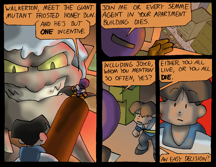
(soooooooooo Head Alien can just blow up the SEMME apartment building downtown whenever he feels like it? that feels like it should be untrue)
128 isn’t there anyway, so H.A.’s threat to blow up Joyce is a bluff. Why not the whole thing?
Maybe he can’t, but is hoping Walky doesn’t know that?
And how the hell does H.A. come up with these concepts, anyway? I mean, seriously, a giant mutant frosted honey bun? Is the idea here that when the good guys stop to say, “Blimey, is that a giant mutant frosted honey bun?”, Honey takes the opportunity to squish them?
I’m just amazed that Robin never devoured the guy.
Okay, now we need to see that battle.
What I want to know is how Willis came up with it.
Why do I have to be hungry right now?
“that feels like it should be untrue”
Such a diplomatic way to say “What the hell was I on?“
Recoloring is the change from the originals I like the best. The new shading on this page gives it a much more ominous mood.
Willis I’m not accusing you but- OK maybe I am, you were drunk off your ass when you thought this thing up weren’t you?
I was twelve!
So, biologically drunk off your ass. >_>
hehe yeah what were you on Mr. W?
Giant Frosted Honey Buns with evil grins no less.
And how CAN HA blow up the building and if he could, why bother to tell Walky-why not just do it? (I know, he wants Walky to come to the dark side so he threatens him. Walky won’t know the diff. or will he?)
Sounds like the finally of Teen Titans season 1…cool
I’ll agree that overall the newer coloring looks better… but I thing the airbrushing effect really looks good on Honey Bun. Pity you couldn’t have found a way to keep that on him.
Also, I must admit curiosity to why you decided to change the picture of the buildings in panel 2 from color in the original to black & white in the updated version.
Definitely agreed. I always thought Honey Bun looked *fantastic* in the original. Not that the updated one looks bad…I just kinda really liked the original one for some reason.
Er, make that “I think the airbrushing effect…” Man, typos are at their most annoying when they make actual other words.
Agreed regarding Honey Bun, but I imagine it’s an absolute royal pain to re-color, so out of sympathy to Willis I won’t complain.
Regarding the change from colored TV to black-and-white TV, I for some reason thought the screen was a window when I first read through the IW! archives, so for me at least the change makes the scene a little clearer.
I’ll be honest. I like the airbrushing a lot more for this scene. It gives GMFHB a better look.
I’d really like to know if there’s a story behind the GMFHB.
The ramblings of a pre-teen sugar junkie that somehow became an actua webcomic?
I mean, this is basically Axe Cop before there was Axe Cop.
Out of curiosity, why are you making all the work of recolouring them for yourself in the first place?
I believe it’s because Willis either never saved or no longer has hi-res versions of the early comics. Since he’s rescanning the B&W line art, that means all color comics must be re-colored. These new versions then have the double benefit of being ready for physical publication and for re-posting on this website at a larger size and better quality (better file compression technology!) than back in the day.
I love the new coloring style. I love it so much I want to see it more often. It’s sharper, the colors are more vibrant, and each scene has a basic color identity that pops a lot better.
Most importantly, it fits with the art. The old style was so overblown it felt like a failed experiment to me even when it was new. Good riddance, I say!
I get that it’s supposed to be folds in his pants, but Walky kinda looks like he has goat legs… =|
Maybe he`s secerlty a fawn or a satyr!
Your big threat is to give a very hungry young man a mosnter he cna eat?
Head Alien, just how dumb are you?
Come to think of it, I don’t think anyone ever actually DOES eat Honey, but it’s been years.
Yeah, the original airbrush coloring is kinda an eyesore. Ignoring it here was a good call.