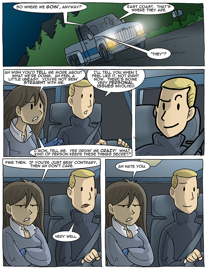
East coast.
on December 17, 2017 at 12:01 amOh no! I forgot to mention on yesterday’s update that it was the LAST STRIP EVER with hand-written dialogue! It’s all computer typefaces from here on out.
Why? Well, you see, the crossover with T Campbell’s Fans! is imminent, and, um, he writes a normal number of words in his scripts. Me, with my large-ass yet barely-legible handwriting, was often writing the tiniest of threadbare sentences just to fit words into panels, and I was like… no. Let’s… try something else. I felt that I should be moving instead of making him write stupid-short sentences made outta Awkward Nigh-English. And so Fonts Happened, which are way more readable at smaller sizes. I wanted to start it earlier than the crossover itself, just to work the kinks out ahead of time.
And what happened then? Well, in the Walkyverse they say that the characters’ dialogue grew three sizes that day.
It is honestly one of the best changes I have ever made for myself.
It’d be a while before I got a typeface made of my own handwriting, though. Until then, enjoy… what is this, Anime Ace?
YUM JaAM
My handwriting is pretty crappy too. It makes it easier for me to read other peoples’ nigh illegible handwriting though.
I “got gud” at handwriting essentially by writing over typed lettering
NOT tracing, they are my handwritings
Reason: theoretically it improved my handwriting but it’s been a while since I’ve done it so idk if it worked since it’s basically scrawl again
My handwriting has always been terrible, too. All through my school years I heard nothing but “Your writing is awful!” “I can’t read this!” or “What is this scribble supposed to be?!” for anything I did. In middle school, the english teacher got fed up with it and made a big show of assigning me (and only me) some Kindergarten-level penmanship workbooks. They and the principal got a nice letter from my parents the next day, so the teacher relented and at least didn’t make it count against my grade. I filled the whole thing out the next weekend, with my non-dominant hand, with a crayon in a fist like a toddler. I’m nothing if not sarcastic.
It’s over 20 years later, and I still have a complex about my bad handwriting. It’s much better than it used to be, but I still write everything in small caps and use fine point drafting pens to compensate for it.
My handwriting is the best personal cipher you could want if I’m writing quickly (I’m the only one who can read it, or at least I can most of the time) and actually not half bad if I take my time. It’s still pretty…distinctive.
When I was in school I actually hit on the idea that if I wrote smaller, I could write more neatly. At least one teacher started keeping a magnifying glass on her desk, but if you could magnify it you could read it. I’ve relented somewhat since then (my job and our ABC license relies on keeping records other people can access easily), but I still won’t use wide ruled paper. It’s college or legal or the keyboard on my phone.
My handwriting has been, and will likely continue to be, completely illegible. I make up for this by always having a pocket supercomputer on my person.
Comic Sans or GTFO
Hahahahahahahahaha… no.
Could be worse. There could be a movement to force everyone to return to the original Helvetica.
SWEET SWEET REVENGE!
Yeah, I like your handwriting more than this standardized font. I’m glad that you eventually got a typeface set up.
You know, Sal, I really think that, if you wanted to, you could probably take control of the vehicle from Jason. If he wants your help, a little disclosure is required and I don’t think that he’s ever done anything to deserve your unquestioning trust!
Interpanel two to three: Where did I put my eyebrows? I need them…ah here!
Is panel five nigh unto pillow talk for these two?
(PS I’m left-handed so anything which prevents me from even block printing is a service to others.)
Yeah, that looks like Anime Ace. I tried the “2.0” version of the font, typed Sal’s dialogue in the final panel, and it looked almost exactly like the strip above. (I’m not sure, but I think the middle bar of the “E” may have been edited to be a little more pronounced in the newer versions of the font.)
My way of trying to prevent scrawling in my own handwriting is to try to picture how letters are supposed to look, then move my hand slower than normal to trace out approximately the right shape. But my hand isn’t very steady and I’m not great at spatial reasoning, so it sorta comes out like a Super Mario logo.
I can also write cursive (that’s how I sign my name) but it’s basically a similar process with one mostly-continuous stroke, I picture the cursive letters and try to sort of make them shaped write. If I do it fast it turns into illegible loop-de-loops though.
Where’d Jason find a 6-wheel Jeep Comanche?
For some reason the variety of Jason’s expressions in this strip cracks me up. Maybe it’s because when I look at panel 3 it’s like looking in a mirror.
Originally posted:
April 6, 2003