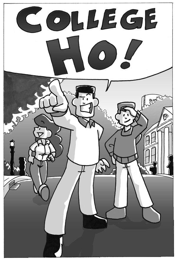
College Ho!, page 2
on September 11, 2012 at 12:01 amChapter: College Ho!
Location: Indiana University
Ah, here we are. Â Non-parents.
Can you believe this illustration took up an entire comic book page? Â There’s enough detail here to fill a tiny panel, maybe.
Also, note how I set them on the front of a hill, craftily removing the need to draw much background.
Is that black shape next to the lamp post a fire hydrant or a person?
In 2001, I was extremely proud of this page.
I know you’re a bit of a womanizer, but that’s not a nice thing to say, Joe.
I want to point out the dual-meaning of “ho”, but that’s the entire joke.
On the next page Joe says “And look! Another college ho!”
So yeah. You called it. Congrats.
Wow, Willis sure had some clever wordplay back then.
Yay, I’m Howard!
Which gives everyone else here a great excuse to ladle abuse on you!
If you squint really hard you can see the start of Willis’ style.
Highlights on the top of the hair? Check.
…Um, beyond that…
Danny has a triangle bang.
Yeah, but it’s not centered in the middle and obscuring most of his forehead.
That’s why it’s only the start.
Sal’s (Sal? Smiling? Weird.) triangle smile continues to live on through Faz & Joyce.
Well, this is early.
Nice gums there, Joe.
He may wanna have that looked at.
I’ll bet he wants to get it looked at. By a lady. With her tongue.
He’s standing against a wind machine to look more awesome.
Trying to figure out if Sal’s shins are made of rubber, or if she simply has no knees.
If she does they’re bending in a very odd direction…
That’s Joyce.
It is not.
The commentary is the best part. ROFL
I feel a bit like I’ve stepped through a time vortex/portal/whathaveyou…
As for the unidentified shape next to the lamp… I think it has a nose?
Fire hydrant.
So Joe just says this over and over for the rest of the comic, right?
Comic-book format suffers when it’s one page a day.
That shadow looks vaguely like Ruth.
Literal foreshadowing?
She does have a very distinctive hair puff….
I… wow, Willis, your readers are dicks. Also, I’d like to thank you for reminding me that I’ve been faithfully reading your comics for over a decade. And that your living body of comics are now older than I was when I started reading them.
We’re not dicks, we’re just pointing out how much he has improved over the years. Although if you catch me when I wake up I’ll probably insult you.
That’s Sal?
Wow, she changed over the years…
*didn’t start reading until Shortpacked!, never archive-binged*
The artistic merit of this page is not so limited that it fails to impress me. The composition is effective, Joe’s pose is striking and so is the sense of perspective derived from it.
Yeah, I’ll second that. Just because the actual linework is rudimentary doesn’t mean that it’s not very well put together. And honestly I’m not sure that pose would work if it wasn’t on a hill, it gives a real “top of the world” sense to him.
I honestly think I’ve spotted more people complaining about people complaining than I’ve spotted people complaining.
ohmygod you guys let’s all be reverse-hipsters. THE OLD STUFF SUCKS I LIKE THE NEW STUFF BETTER YOU’VE DEFINITELY HEARD OF IT
is this what the comments are always going to be like? let me know so i can intentionally avoid them, k?
Willis’s description of the commentary was “so I can apologize for how awful it is.” I think that entitled us to some lighthearted riffing.
Besides, if we all honestly thought the old stuff was that terrible we wouldn’t have stuck around this long. It does have a certain charm to it.
Also, you being so extremely judgmental with that Mary avatar is great.
Mary is Hoop’s spirit animal.
i gotta admit, i laughed when it happened.
It is now my goal in life to be a reverse hipster.
Thank you.
David, I think it’s cool that you’re reposting these from the beginning daily. I never read Roomies! but I read DoA & SP now, so this is another fine stop on my mornings of reading comics. 😀
“In 2001, I was extremely proud of this page.”
And you were right to be. In 2001.
Eleven years later it’s safe to say you have continued to improve.
I agree- it’s a pretty solid composition.
A toast to the Ho!
I may be wrong, but I think that ambiguous silhouette might be Ruthless.