Ya know, I have/have seen a billion typefaces almost but not quite exactly like Arial/Helvetica, but whenever I get rid of one, it changes the default text settings in my browsers JUST enough to make me angry and I never remember what I got rid of in order to change it back
About the only workaround is I finally stopped using the main website on which I notice the changes, bc they got into this skeevy crypt0 scheme
Decorative fonts for decorative purposes are fine, as long as they aren’t over-used and meet the mood of the decoration. They are better in display purposes than body fonts.
I’d rather see Algerian or Harlow on an awning or header of a menu than, say, Ariel or Times New Roman. Conversely, a designer using Harlow for the running text of a menu should be fired and their pay withheld.
I think it’s mostly their blatant overuse, particularly in situations where they are thematically inappropriate.
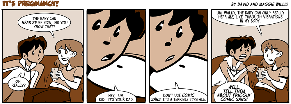
The issue is often that the person using the font only knows about that one font, so they use it for everything from announcing a kid’s super-hero themed birthday party (a good use of Comic Sans) to announcing a funeral (a bad or possibly hilarious – but still clearly inappropriate use) and everything in between.
Comic Sans and a large percentage of other widely hated fonts are asymmetrical. The easiest place to see this is that the lowercase letters p, b, q, and d aren’t all perfect flips/rotations of one another. To some people, this makes Comic Sans et al look messy or unbalanced. To people with dyslexia, this makes these fonts look highly readable.
“Comic Sans is recommended by the British Dyslexia Association and the Dyslexia Association of Ireland. An American Institute of Graphic Arts post from last summer said that it might be the best font for dyslexics, given its “character disambiguation” and “variation in letter heights.” While other fonts have been specifically designed to be read by people with dyslexia —Dyslexie and OpenDyslexic are two — they just don’t have the availability of Comic Sans. To hate on Comic Sans is “ableist,” Hudgins argues, and doing so discounts the reading difficulties of millions of people.”
Comic Sans has a distinct virtue. It is readable at ridiculously tiny point sizes. As a cartographer, I often use it on very small labels. No one can tell it’s Comic Sans, but they can sure read the label. It is undeservedly hated, most likely due to occasional inappropriate use, and general bandwagon style reactions.
*Machete uses Papyrus*
NOOOOOOOOOOOOOOOOO
I mean, his name does rhyme with “spaghetti.”
If you pronounce it like a stereotypical white American, anyway.
comic sans is pretty rough but it’s nowhere near the top of the heap as far as bad fonts i see everywhere go
if i never see a storefront use algerian again it’ll be too soon
Almost any font created as “decorative” should be avoided.
i wouldn’t go that far, every awning using arial is also pretty bad
That feeling when you see a row of business names in Arial, but then you realize one of them is actually Helvetica.
Ya know, I have/have seen a billion typefaces almost but not quite exactly like Arial/Helvetica, but whenever I get rid of one, it changes the default text settings in my browsers JUST enough to make me angry and I never remember what I got rid of in order to change it back
About the only workaround is I finally stopped using the main website on which I notice the changes, bc they got into this skeevy crypt0 scheme
Decorative fonts for decorative purposes are fine, as long as they aren’t over-used and meet the mood of the decoration. They are better in display purposes than body fonts.
I’d rather see Algerian or Harlow on an awning or header of a menu than, say, Ariel or Times New Roman. Conversely, a designer using Harlow for the running text of a menu should be fired and their pay withheld.
What font is the text in the speech balloons?
Walkyfont 2.0(?), it’s based on Willis’ handwriting.
For an easy example of WalkyFont 1, check the DOA speech-bubble text prior to Book 7.
You could’ve told him this yourself a few months ago David. Just sayin’
I’ve never understood the hate for Comic Sans, or Papyrus for that matter. I don’t consider them all that bad.
I think it’s mostly their blatant overuse, particularly in situations where they are thematically inappropriate.
The issue is often that the person using the font only knows about that one font, so they use it for everything from announcing a kid’s super-hero themed birthday party (a good use of Comic Sans) to announcing a funeral (a bad or possibly hilarious – but still clearly inappropriate use) and everything in between.
Comic Sans and a large percentage of other widely hated fonts are asymmetrical. The easiest place to see this is that the lowercase letters p, b, q, and d aren’t all perfect flips/rotations of one another. To some people, this makes Comic Sans et al look messy or unbalanced. To people with dyslexia, this makes these fonts look highly readable.
https://www.thecut.com/2020/08/the-reason-comic-sans-is-a-public-good.html
“Comic Sans is recommended by the British Dyslexia Association and the Dyslexia Association of Ireland. An American Institute of Graphic Arts post from last summer said that it might be the best font for dyslexics, given its “character disambiguation” and “variation in letter heights.” While other fonts have been specifically designed to be read by people with dyslexia —Dyslexie and OpenDyslexic are two — they just don’t have the availability of Comic Sans. To hate on Comic Sans is “ableist,” Hudgins argues, and doing so discounts the reading difficulties of millions of people.”
Comic Sans has a distinct virtue. It is readable at ridiculously tiny point sizes. As a cartographer, I often use it on very small labels. No one can tell it’s Comic Sans, but they can sure read the label. It is undeservedly hated, most likely due to occasional inappropriate use, and general bandwagon style reactions.
I will die on this hill.
It’s like onions in food, if it’s not noticeable, idgaf but if it’s HUGE, EEW
Fair enough. It’s absolutely not a display font.
“Them?” Do you mean there is more than one baby there, like friggin’ twins?
He’s just avoiding assuming the kid’s gender before they’re even born.
…
Although he’s met Bobby as an adult, and knows he’s a dude.
…
Stupid time travel.
…
OK, he’s just trying to normalize using ‘they’ by default.
They’re pretty sure the Machete they interacted with was their son from this timeline, but this could still be another DJ case
It’s the gender neutral them.
So no Machetes in plural, dang!
We didn’t know